
malév.com
main page re-design
main page re-design
Our goal with this project was to give a face lift to the malév.com website. This was not the time to make drastical changes on the website, however it was required to do some refreshing modifications on it. We wanted to give access to the most important parts of the website in a visually appealing way, show more about our destinations and simplify the webpage by reducing it’s height and making it more compact.
the old site
the new design
We have replaced some core elements of the website and as you probably already noticed on the old design that the footer seemed to be new. Unfortunately I can not show you the old future which consisted thre long columns of text links with dark blue text and a gradient gray background.

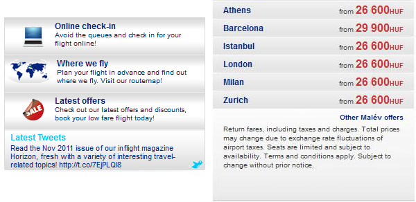
the old section under the carousel

We wanted to give our visitors something visually more appealing. More information, more functionality and give the nice feeling of travelling, through beautiful photos..
the new section under the carousel
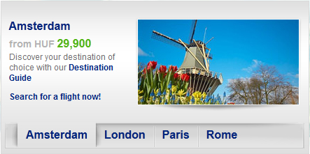
As the small stamp photos and links has been replaced with a more modern offer box we could replace our price list with a friendly and understandable box of links which also contains our latest tweets from Twitter.
We also needed a more attractive booking panel which fits the new design and catches the attention of the user.

It was an honour to redesign the malev main page and the team working on it made the whole process a real fun. It was very well received by our customers so it was a great success as well.


